"Fall 2016: A Unity of Strength, Confidence, and Complexity"-Pantone
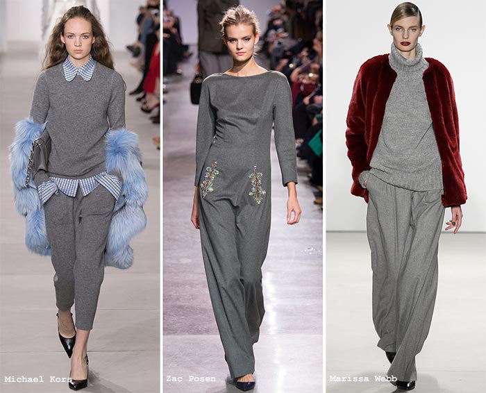
Colors this year are a bit more fun than they were last year. They are "playful yet structured departures from your more typical fall shades". Yes, we'll always have the classics, but this fall they've been given a bit of a new twist. We'll always see hints of past eras, but there's definitely a level of current definition in the color trends for Fall 2016.

Riverside is a key color for fall. It's the base. Every other color is able to work with or bounce off of it with a unified gracefulness. Pantone describes it as cool, calming, strong and stable-the ideal attributes for a sturdy base.It ebbs away from our usual blue. We are no longer looking at navy or cobalt, not a classic, but something with a "subtle vibrancy", still safe, but less safe nonetheless.


Spicy Mustard is EVERYWHERE. It is in the trim, the pattern. It sneaks into accessories and layering pieces, playing well with all other colors in the Fall 2016 palette. It adds a bit of optimism. It's spicier and zestier than the yellows of years past.


Potter's Clay has and added degree of poise and structure. The hue contains hints of russet orange giving a grounded feeling, but a bright one. Again on the optimistic side. Every Autumn needs it's earth tone. This fall, it's definitely Potter's Clay. Picture luxe leathers and suedes.


Other Honorable mentions this fall include-
Sharkskin-For Balance


Aurora Red-"A Welcome Punch"


Warm Taupe-Hearty and Stable


Dusty Cedar-A shout-out to Pantone Color of the Year Rose Quartz


Until next time guys! Thanks for reading.
Erin


